Monday, July 30, 2012

Makeover Monday: A Box Turned House


This Monday we decided to makeover a box.  I know houses out of boxes are pretty standard, but I'm pretty happy with the little porch we were able to make for our house.  This was a bathroom vanity box and in it were these nice thick pieces of cardboard with supports in just the right place to make them hold a 90 degree angle very nicely.  We used them to create the roof for the house and porch and then I had saved some of the nice thick rolls that you get when you purchase the fabric that has to be ordered.  


I planned to spend time painting it a pretty pink color with my daughter one afternoon, but before we got to that, she wanted to "decorate" it.  The decoration process turned into a week long, multiple friend project and it was so fun to see all their ideas come to life. I just left the craft supplies out for a week (until they started making their way into other rooms) and let the kids decorate whenever they got the inclination.  8 kids worked on decorating this bad boy and I think it's just fantastic!


We plan to finish the mailbox, number plate, and flower boxes in the near future. 

Getting Crafty!

Molly


Wednesday, July 25, 2012

Spaghetti and Bean Balls!

As I'm cooking through the Vegetarian Mother's Cookbook I am super impressed with Cathe Olson's knack for creating healthy meals at low cost and I've been surprised by how satisfying and flavorful they are.  Great job Cathe!

In her cookbook, she has a recipe for Bean Balls that can be made as straight bean balls, or she has adaptions for Italian or Swedish style bean balls.  I chose to make them Italian style and serve them up with spaghetti.  They were quick to whip together in the food processor and bake in about 20 minutes while the noodles boil. 


I adapted the recipe slightly because it wasn't turning out the way I thought it should, it could be because I was in a hurry and used a can of beans rather than measuring out precooked beans or it could be that my carrot was too big (it was massive), either way, the mixture seemed too dry and wasn't coming together as I thought it should, so I added an egg as a binder and that worked great. 


Mine flattened out a little on the bottom, but I wasn't going for pretty so it didn't matter to me.  That could have been because I added an egg?


As I simmered and stirred the baked bean balls in the spaghetti sauce some of them fell apart but most stayed whole.  I actually preferred them broken up when eating the spaghetti and will purposely break them up next time to make it more like the ground beef spaghetti I'm used to.


Super delicious and satisfying!

Monday, July 23, 2012

Makeover Mondays: Bi Fold-Shutter Doors Turn Sofa Table

Do you see the Bi-Fold Shutter Door behind the china cabinet?  They were there when we moved in to separate the dining room from the family room.  What you may not notice is that underneath the 70s shades in the family room there is a huge window that, when uncovered, brings in a lot of light and makes the house look so much bigger as you can see out to the back yard when you walk in our front door.  This is one of my favorite features of our house and I certainly didn't want to block it off with bi-fold doors - maybe french doors at some point, but for now I love it just being open. So we had these shutters and I thought surely there is a project we can make with these doors. 

I remembered that Nate Berkus said that if you have the back of a sofa to the part of a room you walk into, you should have a sofa table behind it so that the first thing you see when you enter the room isn't the back of a couch.  Well, not only is my sofa back exposed when you walk in the room, it's the first room when you walk in the front door, so it definitely needed my attention. 


I searched pinterest for projects with shutters and found this fabulous sofa table made out of shutters! Awesome, I'm going to get a sofa table and use the shutters at the same time and spend $0! Love it.  I'm not a woodworker, but my husband and father in law are, so they cut the shutter down to size added a little trim to the bottom and 4 legs added a little paint, and look what we have...


 In the future, I might have a piece of glass cut to sit in the insert where the slats are to make it a completely flat surface, but for now it works great.


Opening Doorways!

Molly

Wednesday, July 18, 2012

Initial Frames

I've always loved those wooden initials that you can purchase at craft stores and nearly any home decor store.  However, I'm on a tight budget and free sounded a lot better.  So, I came up with this idea. 

I took an old frame, sanded it, painted it white, and sanded it to distress it slightly.  Then I found a font I liked and printed out a big "O" for my oldest daughter and a big "L" for my youngest daughter. I cut out the letters and traced them onto scrapbook paper that I had laying around from a previous project.  After cutting them out, I outlined them with a black sharpie - I did it this quickly and not evenly.  Then I simply picked a contrasting paper to tape the letter onto.  I used green and pink because those are the colors of their room.  Then I hung them up over their beds.  I couldn't get a clear picture of the "L" so you only see the "O" but the "L" was made with green paper and backed with pink. 


Pretty cute for a quick afternoon project.


Initialing our Walls,

Molly

Monday, July 16, 2012

Makeover Mondays: Jazzing up an old brass chandelier

When we moved into our new home, we didn't have a big light fixture budget so we replaced the fixtures that just plain needed replacing and worked with others.  Here is a picture of the dining room as it was when we did our walk through.  Notice the brass chandelier...not my favorite.  In fact, I pride myself in seeing an item's potential, but this I really didn't see, it was my husband who said, "Aren't we just going to paint this black?" And I still questioned whether I'd like it, but he was absolutely right.


Here it is when we were in the process of ripping up carpet and painting. 


And here it is redone.  A quick coat of black spray paint and some new shades and it is as good as new.


At first my husband's sister loaned us some black lamp shades, but since the dining room is the only room in our house without windows it gets pretty dark.  I checked out the little shades at Home Depot and Lowes and decided I didn't want to spend that much money unless I got a new light fixture all together.  So, I kept my eyes open and one day while I was out yard saling, I found this fantastic, like new set of golden tan lamp shades for $4 (for the set)! Big score.  Now our dining room is much brighter than it was with the black shades and much prettier than it was with the brass and glass fixture!


Turns out I really like this chandelier after all!


Lighting the Dark Corners!

Molly

Wednesday, July 11, 2012

Get Horizontal!

Isn't that every mother's dream? To get horizontal, even for a few minutes.  Boy I love power naps :)  However, we're not discussing naps today, actually I wanted to share how I made over my entry way.  We have a very small entryway in our house, there's not enough room for an accent table or anything, it's simply room to open the front door and a door to the coat closet. 

When we moved in, I painted an accent wall in our living room chocolate brown.  It's such a deep brown that many people think it's black until they hold something black up to it.  I love it, it's dramatic and pretty and really brings your eye to the focal point of the room, our fireplace.  When we were deciding what to paint the entryway, I was toying around with hot pink! I know, crazy but it's our accent color in the living room (the room directly off our entry) and the entry is so small I thought maybe it could handle the bright color.  Well, I was nervous and several people convinced me to paint it the same color as our accent wall (chocolate brown). 

I lived with it from August to April and then I just couldn't stand it anymore.  The look and feel I was going for in my entry was/is fun and upbeat and this chocolate brown seemed really formal and it was so dark that it felt (to me) like I was entering a cave - definitely not how I wanted people to feel when walking into my home.  So, while my husband was away on a mission trip my parents came for a visit and I talked my dad (who is a professional painter) into painting these horizontal stripes.  I've seen horizontal stripes on Nate Burkus and Pinterest and have loved them every time I see them.  I love how it turned out, every time I look into the entryway it makes me happy.  What do you think?


I would love to hang a round mirror with a really ornate frame in the place where this little picture frame/mirror/key hook thing is, but that will wait until I find a used one somewhere :)


Didn't my dad do a fantastic job? Love it.


Making a statement with stripes!

Molly

Monday, July 9, 2012

Makeover Mondays: Window's Aren't Just for Looking Through

When we got new windows a few years back, I asked them to save the old windows because I had some projects in mind. When I returned home I found, to my dismay, that they saved all the exterior aluminum windows and took the nice wooden frame windows. Ugh. Do you hear my excited heart deflating? I sure did. Thankfully my mother-in-law  was able to salvage one window for me. 

For this project, I cut 8 pieces of paper 4"x6" and taped them onto the window panes where I wanted the pictures to be.  I then sprayed the window with a glass frosting spray paint.  This allowed the window to still be translucent but not 100% transparent. I did this so that I could use tiny pieces of tape to attach the pictures and the frost would cover enough so you don't see the tape. 


Then I opened up the pictures on the computer and played with the contrast and color saturation to make them fun, playful colors and had them printed at Walgreens. 

To hang the window I had my husband or his father (can't remember who did it) drill holes in the back.  They have a jig that makes that keyhole type hole so that the screw or nail fits in the bottom of the hole and slides up to the top (not sure what that's called).

We used this method to make sure it was securely fastened to the wall because we hung it over the crib and it is heavy.  We didn't want her to be able to pull on it enough to get it to fall on her.  We also pre-drilled our holes and used plastic anchors to help make it super sturdy. 


Not too long ago as I was driving home, I saw this little window sitting by the curb...score! I think it looks pretty just hanging there and would look nice painted an accent color as well.  However I have another idea that I will share in a future post. 

Turning Trash into Treasure,

Molly


Wednesday, July 4, 2012

Pasta with Vegetables and Pine Nuts

Cooking through the Vegetarian Mother's Cookbook, Recipe # 3, Pasta with Vegetables and Pine Nuts.

I was so glad we tried this dish, I bought the broccoli and cauliflower two times before actually making it.  It has great flavor and was easy to put together.  I added half an onion to the recipe because I LOVE most any dish that starts with sauteing onion and garlic. I used rice penne noodles as well to avoid gluten.  I have heard that rice noodles get mushy, so I was careful to pull them off the stove top as soon as they were al dente - actually a little more firm than I usually cook pasta - and they turned out perfect.  We had no problems with the noodles breaking or getting mushy and they weren't too hard either. 


What I like about this dish is that it is full of vegetables but it doesn't feel like you're eating a plate full of vegetables. 


I'm not a fan of mushrooms, but I think if you are, this recipe would be a good one to add mushrooms to.  To see some of Cathe Olson's recipes, visit her blog or check out her cookbooks.


Monday, July 2, 2012

Makeover Mondays: Office Chair turned Side Chair

I love how Nate Berkus can take something hideous and turn it into something beautifully modern and fresh.  This project was inspired by his show.  He's always talking about getting chairs at a yard sale and painting and reupholstering them.  So, I thought I needed to give it a try. 

We just moved into our home last summer and it's nearly 50% larger than our first home.  At any rate, we went from one sitting room to two and our budget doesn't accommodate buying new furniture.  So, I combed craigslist for weeks waiting to find the right set of chairs for our living room.  And, wouldn't you know it, some wonderful woman posted these ugly office chairs for free. 

Convincing my husband to drive across town to pick them up and that they would actually be comfortable and nice looking when I was done was the hardest part of this project :)  But, he's smart, so he finally agreed to go get them. 

Here's what we picked up.


Not so bad, two of these office chairs, a little dirty, a little ugly, but they have potential. 

I immediately started taking out staples and screws. While I did this, I wrote down what I did so that I could redo it in reverse order.  It's also a great idea to take pictures of each step to help if you get stuck on a particular step. When I had all the fabric off, I gave the wooden frames to my husband to sand and paint.  I went to the fabric store and purchased fabric and 1" foam to make the seat a little more cushy. 

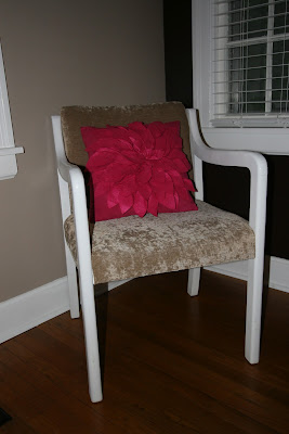
I sewed the part that needed sewing and then my husband and I stapled and screwed them back together.  Here's what the finished product turned out like. 


Pretty nice set of side chairs for $15 a piece!


Decorating on a Dime,

Molly